Good Poster Design – A Guide
February 28, 2024
Printed posters and flyers capture attention like no other media. You might be thinking that social media is where the real marketing juice is, and you’re not wrong. But, with so much advertising online and on social media, posters cut through the clutter. They also reach a new audience that you might not otherwise. Posters are also affordable to produce, making them a low-risk, high-reward add to your marketing strategy.
Whether you’re organizing a local concert, advertising a sale, or spreading awareness about a cause, a great poster can make a big impact.
In this blog post, we’ll cover:
How to Create an Effective Poster
All posters and flyers are not created equal. A good poster design is a combination of content, graphic design, and user experience (UX). UX is defined by the Interaction Design Foundation as “the process design teams use to create products that provide meaningful and relevant experiences to users. UX design involves the design of the entire process of acquiring and integrating the product, including aspects of branding, design, usability and function.”
Though UX is a term used to describe online experiences, the concept applies to traditional media. You want your poster to appeal to your target audience, be easy to understand, and drive action.
The Elements of a Successful Poster
- Standout Headline
- Readability
- Balance and composition
- Typography
- Color scheme
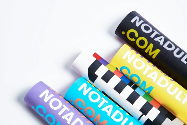
- High-resolution images
- Whitespace (negative space)
- Brand identity
- Call to action
Strong headline
Your headline is the hook that will get people to read more. It’s important to craft a compelling and concise message that sparks curiosity. Use action words and convey the main purpose of your event or offer. For example:
- “Join Us for the Ultimate Music Festival!”
- “Big Sale: Up to 50% Off!”
Readability
Your flyer’s font choices and text layout play a crucial role in its overall impact. Opt for fonts that are easily read, and make sure there’s a good contrast between text and background colors. If your poster has a dark background, go with lighter typeface and vice versa.
Guide your readers’ eyes with a clear visual hierarchy. Prioritize your poster content based on its importance. Here’s how:
- Main Headline: Larger fonts, centered or at the top
- Subheadings: Smaller font size, supporting key details
- Body Text: Legible font that provides important information
A note about social media handles and contact information: They should be easy to see and read but not be central to your poster design—unless your goal is to increase followers!
Balance and composition
Maintain balance in your design with text, images, and graphics. Distribute elements evenly across the flyer. Avoid clutter by leaving enough white space. Remember, less is more.
Typography
Consistency is key. Stick to 2-3 fonts—one for headlines, another for body text. Above all things, your poster needs to be easy to read. Stick to substance over style when it comes to typeface! In other words, if a font looks great but is hard to read, it’s not going to help you sell tickets or attract new customers.
Color Scheme
Colors evoke emotions and set the tone. Select a color palette that aligns with your brand or event. Use complementary colors for contrast, and make sure text stands out against the background.
High-resolution images
Visuals are extremely powerful and can help you convey concepts in a glance. If you’re promoting a concert, show a photo of the band performing. If you’re promoting your recently opened restaurant, include photos of your food or the dining space.
Whitespace (negative space)
Don’t underestimate the power of whitespace. It gives your design and text room to breathe. Use it strategically to emphasize key elements. A cluttered flyer can overwhelm readers. Once you’ve lost their attention, you’ve lost your chance for them to take action.
Brand identity
Reinforce your message. Repeat key details like the event date, time, and location. Feature your logo or brand identity within your design. Remember—consistency builds recognition.
Call to Action
A clear call to action (CTA) is crucial. Tell your audience what you want them to do next—whether it’s donating, buying tickets, or RSVPing. To maximize response rates, make your CTA prominent and direct. Hootsuite’s article How to Write a Call to Action explains everything you need to know about writing a successful CTA!
If dealing with design tools isn’t your idea of fun or if you can’t afford a graphic designer, a successful poster is still in your future.
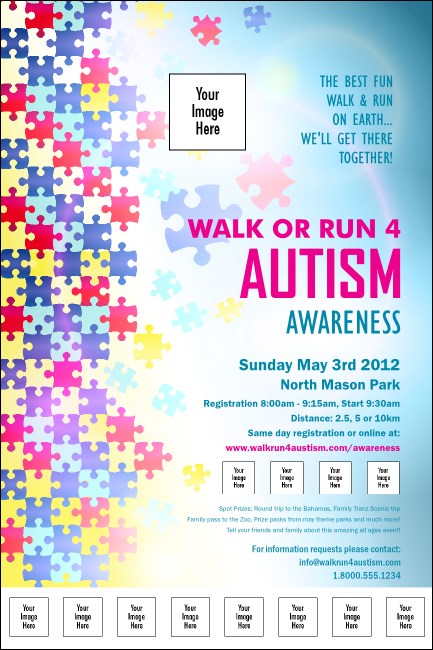
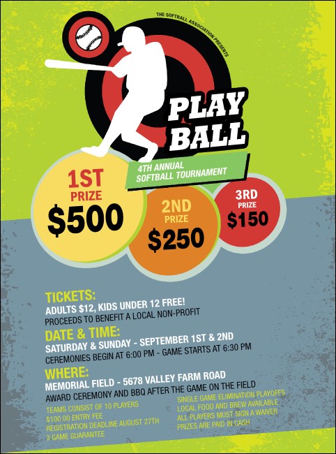
Design Hack: Poster Templates
It takes time to pull together design elements into a great poster. It’s also extremely helpful if you have a knack for creative tasks. If you lack the time or inclination, poster templates are a life saver!
Since they’re predesigned, you don’t have to worry about font choice, visual hierarchy, or negative space. Poster templates are also built to be easy to customize. All you have to do is choose your poster template, add your important details, and upload images.
The trick is finding the right poster template—on Eventgroove, there’s hundreds from which to choose. Plus, if you’d like to swap in your brand colors or add a QR code, our design team can help.
Plus, once you’ve customized your poster, we’ll take care of the printing. Your order will arrive at your door in a flash—we turn print projects around in one business day.
Ready to get started? Browse Eventgroove’s poster template selection, or use our online poster maker to create your own design.
Back to blog Back to top


